Read time: 3 minutes
TL;DR: Visual identity, tagline, & applied mockups for an author brand identity writing emotionally intense queer romance.
L.A. Cannon writes queer fiction that’s gritty, emotional, & raw. Her work centers on heavy emotional themes, complicated characters, & a voice that leans dark & lyrical. When she reached out out for an author brand identity, she already had a basic identity in place, but wanted something more polished while still holding the weight of what she writes.

Brand Needs & Direction
L.A. is a woman who both knows what she wants but has trouble figuring out how to voice it exactly. Don’t get me wrong, she was extremely clear, but it had to be just right. She didn’t want anything corporate, cartoonish, overly gendered, or too decorated. Symbolically, she’s drawn to the lotus & spider lily flowers that represent her writing themes & personality: resilience, survival, & transformation.
What We Created
Working with creatives means they love being involved in their branding. No worries!
L.A. wanted her pen name to remain simple, structured, & clean enough to scale. She fell in love with a certain typography family, so no need to search for the perfect serif for a custom logo. I began to shape a custom serif wordmark with an icon based on a symbol she loves.
Next came hand drawing some elements, including the pièce de résistance: the custom lotus flower. I spent hours on this (just ask her, she’s a trooper) until I got it just right & showed her a filled-in & outlined version.
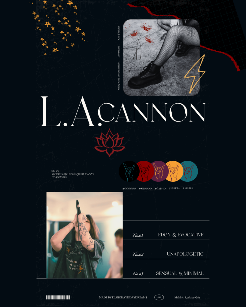
The icon had to be versatile & strong on its own, without looking decorative or soft. It shows up across mockups as a sticker seal, a merch stamp, & a mark that can stand in when the full name isn’t present.
Born from stories & writing that feel intense, emotional, & unapologetically raw, I presented what I felt was a perfect brand tagline for her author brand identity: Love was never meant to be gentle.
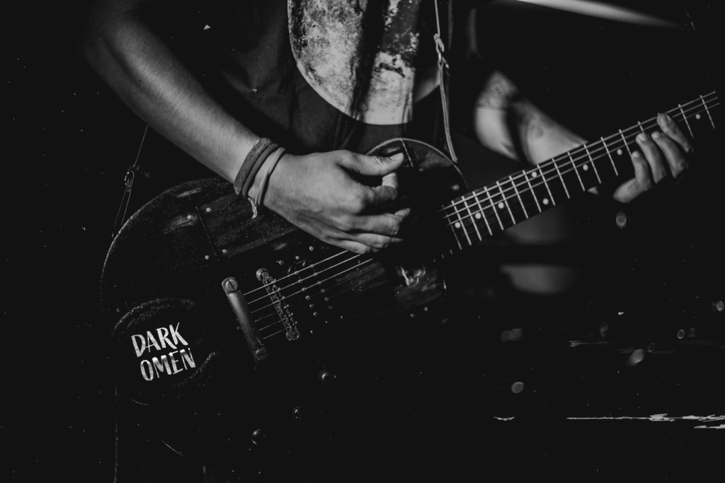
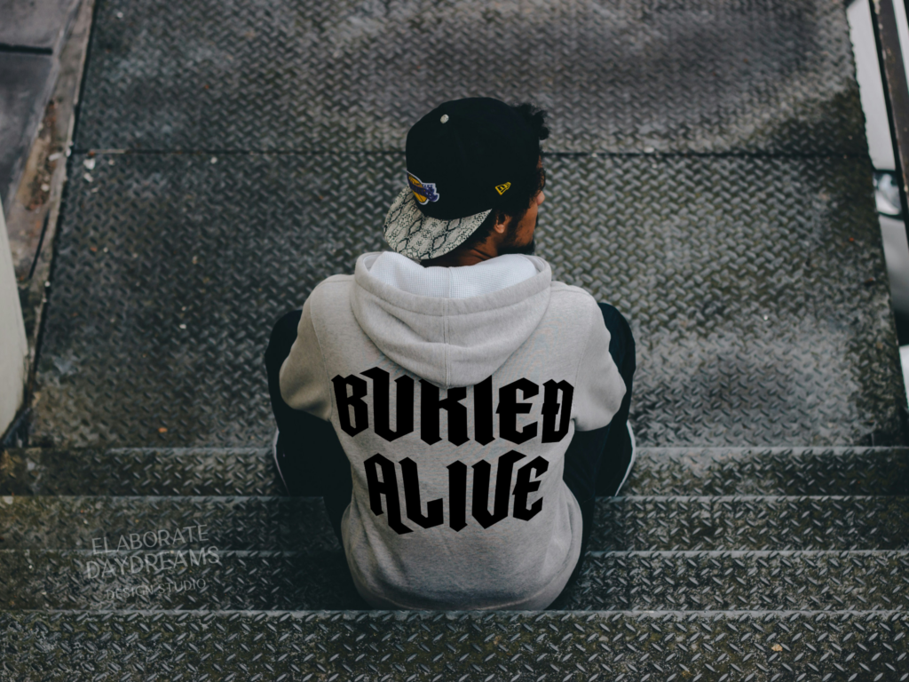
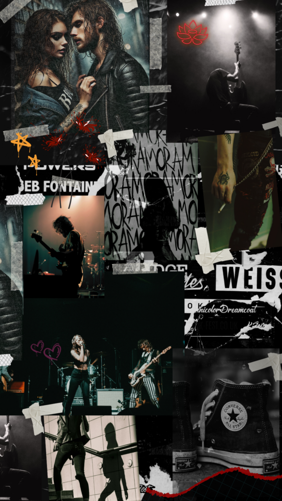
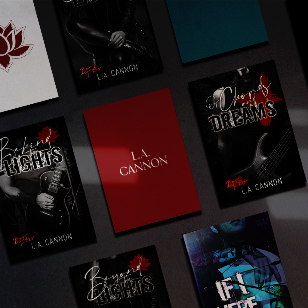
Once the core pieces were in place, we built mockups to show how the brand could stretch across physical touchpoints: book previews, packaging, merch. For fun, I created fictional logos & mockups for the metal bands living in her fictional world. The covers shown were not designed by us, but we used them to explore how the system would hold together in context.